Heart's Door
Graphic Design + Stationary Package

Overview
A school project in a graphic design course at BCIT. The goal was to create a stationary package for property development project of your choice. The project was supposed to be marketed as environmentally friendly and “green living” townhomes.
Tools
- Adobe Photoshop
- Adobe Illustrator
Project Concept

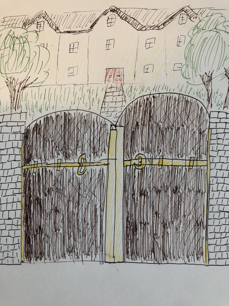
After sketching out project ideas based on the idea of "an environmentally friendly and green-living townhome", the core concept was determined as "co-live with nature and feel at peace with the heartbeat of trees"
Brand Design

The brand's colour scheme is the combination of brick red (#fff600) and bright yellow (#aa001b). The yellow has the impression of the joy of living in the townhomes, and the brick red gives the warmth of the green living.
The logo was made with Adobe Illustrator and symbolizes the heart of trees and the door of the townhomes to express the feel of living experience there.
Stationary Package

The stationary package for the brand was made with Adobe Photoshop. The brand colour and the logo was integrated in each piece of the stationary items to enhance the brand's value.
